Creating complex forms in a React app can be quite tricky. You have to deal with state management, validating user input, displaying error messages, styling, and so on, so things can get complicated fast.
One tool that we can use to make our life easier is KendoReact Forms. They provide a set of React components that we can combine and configure however we need, to help us build fully-featured forms quickly. They don’t have any other dependencies, so integrating them into our apps is very straightforward.
In this article we’ll use KendoReact components to build forms that validate user input in different ways (required fields, email addresses, etc.), display the appropriate error messages, and have a stylish and consistent look-and-feel.
Getting started
To get started with KendoReact Forms, we’ll first need to install the corresponding dependencies into our app:
npm install --save \
  @progress/kendo-drawing \
  @progress/kendo-react-buttons \
  @progress/kendo-react-dropdowns \
  @progress/kendo-react-inputs \
  @progress/kendo-react-intl
While not strictly necessary, we’ll also be installing @progress/kendo-theme-material to use Kendo’s Material Theme, which looks really cool. 😎
Creating a basic form
Creating the form itself is straightforward. We just need to put together the fields we want, and apply the necessary classes for styling:
import React, { useCallback, useState } from "react";
import { Button } from "@progress/kendo-react-buttons";
import "@progress/kendo-theme-material/dist/all.css";
const MyForm = () => {
// ...
return (
<form className="k-form" onSubmit={onSubmit}>
<fieldset>
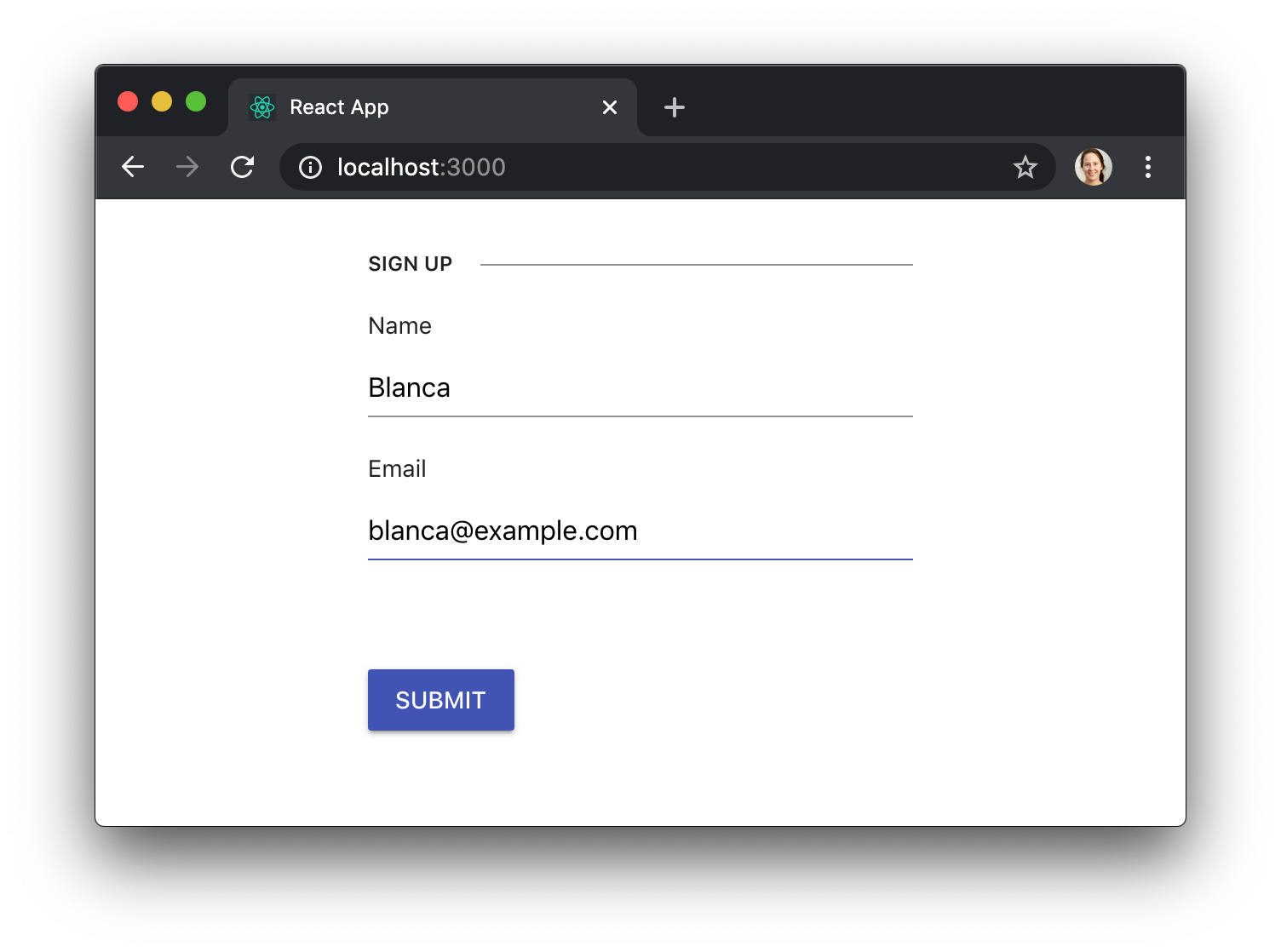
<legend>Sign up</legend>
<label className="k-form-field">
<span>Name</span>
<input
className="k-textbox"
name="name"
required={true}
value={name}
onChange={onChangeName}
/>
</label>
<label className="k-form-field">
<span>Email</span>
<input
className="k-textbox"
name="email"
required={true}
value={email}
onChange={onChangeEmail}
/>
</label>
</fieldset>
<Button type="submit" primary={true}>
Submit
</Button>
</form>
);
};
In that example we were using native HTML controls, but we can use KendoReact components too, if we need a more advanced widget like a DropDownList:
import React, { useCallback, useState } from "react";
import { Input } from "@progress/kendo-react-inputs";
import { DropDownList } from "@progress/kendo-react-dropdowns";
import { Button } from "@progress/kendo-react-buttons";
import "@progress/kendo-theme-material/dist/all.css";
const MyForm = () => {
// ...
return (
<form className="k-form" onSubmit={onSubmit}>
<fieldset>
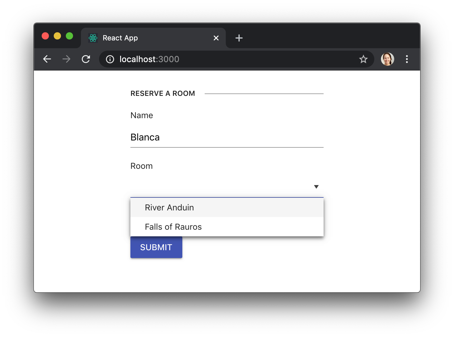
<legend>Reserve a room</legend>
<label className="k-form-field">
<span>Name</span>
<Input
name="name"
required={true}
value={name}
onChange={onChangeName}
/>
</label>
<label className="k-form-field">
<span>Room</span>
<DropDownList
name="room"
required={true}
data={rooms}
value={room}
onChange={onChangeRoom}
style={ { width: "100%" } }
/>
</label>
</fieldset>
<Button type="submit" primary={true}>
Submit
</Button>
</form>
);
};
Validating user input
When using KendoReact controls in our form, we can specify additional properties that will cause the field to be validated. For example, specifying required={true} on an Input will make sure that the field is filled out, while specifying type="email" will make sure that it has the right format for an email address:
const MyForm = () => {
  // ...

  return (
    <form className="k-form" onSubmit={onSubmit}>
      <fieldset>
        <legend>Sign up</legend>
        <label className="k-form-field">
          <span>Name</span>
          <Input
            name="name"
            required={true}
            value={name}
            onChange={onChangeName}
          />
        </label>
        <label className="k-form-field">
          <span>Email</span>
          <Input
            name="email"
            type="email"
            required={true}
            value={email}
            onChange={onChangeEmail}
          />
        </label>
      </fieldset>
      <Button type="submit" primary={true}>
        Submit
      </Button>
    </form>
  );
};
There are other props like minLength, maxLength or pattern that allow even finer control over field validation. Feel free to explore the KendoReact documentation to understand how to use them.
Preventing form submission on invalid data
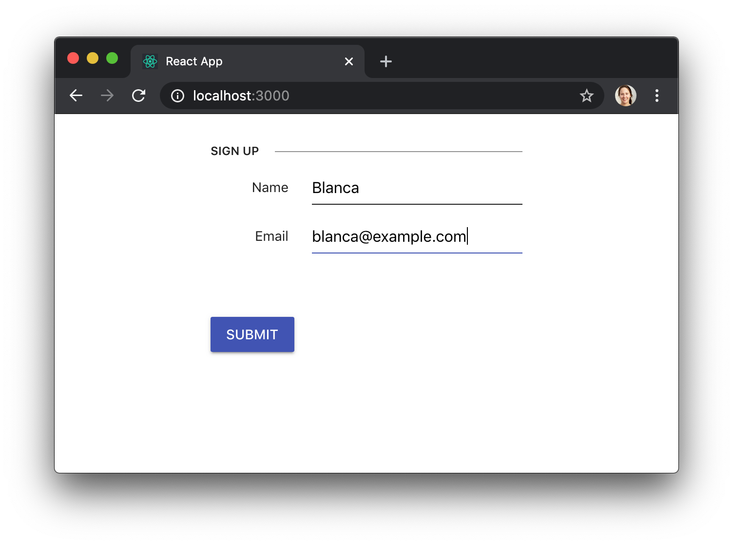
User input gets validated right before the form gets submitted too, without us having to do anything. If the validation fails, for example because the user didn’t fill a required field, the form submission will be prevented, and an appropriate error message will be displayed:
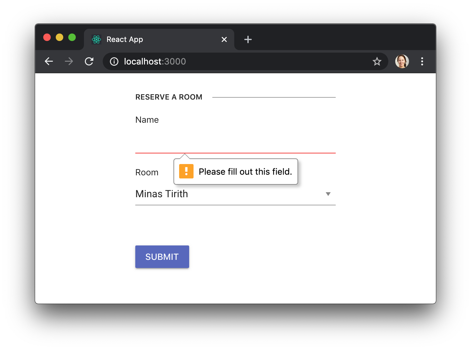
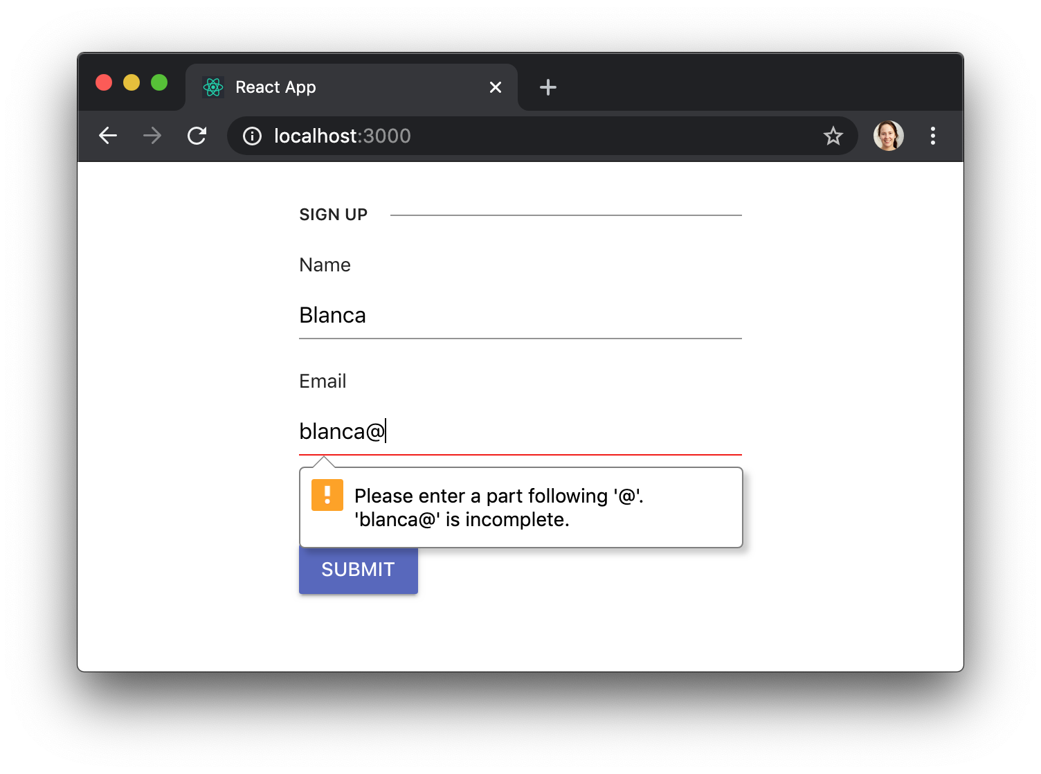
Different validations will cause different error messages to show up. Here we’re entering an invalid email address:
Advanced styling
KendoReat Forms also allow us to customize the styles of our forms, while maintaining a consistent and professional look.
For example, we can make our fields render their labels inline by replacing the k-form class with k-form-inline:
const MyForm = () => {
  // ...

  return (
    <form className="k-form-inline" onSubmit={onSubmit}>
      {/* ... */}
    </form>
  );
};
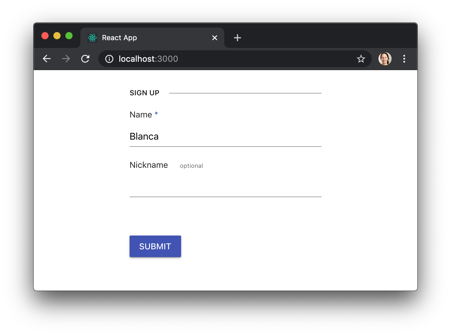
We can also let the user know that a field is required by adding a span with the class k-required, or provide additional information by adding a span with the class k-field-info:
const MyForm = () => {
  // ...

  return (
    <form className="k-form" onSubmit={onSubmit}>
      <fieldset>
        <legend>Sign up</legend>
        <label className="k-form-field">
          <span>
            Name <span className="k-required">*</span>
          </span>
          <Input name="name" required={true} value={name} onChange={onChangeName} />
        </label>
        <label className="k-form-field">
          <span>
            Nickname <span className="k-field-info">optional</span>
          </span>
          <Input name="nickname" value={nickname} onChange={onChangeNickname} />
        </label>
      </fieldset>
      <Button type="submit" primary={true}>
        Submit
      </Button>
    </form>
  );
};
You can find out more tricks in the KendoReact docs for Styling the Appearance of Forms.
Conclusion
KendoReact Forms components and styles take care of the tedious aspects of building forms, so that you can focus on the business logic. They give you enough flexibility so that you can configure eveything the way you need, but they provide a consistent user experience and look-and-feel, so that your app feels super polished. 💅
This post was originally published at https://www.telerik.com/blogs/building-a-fully-featured-react-form-component-kendoreact-form-example.